Dhirendra Paudel
UX DESIGNER in Training
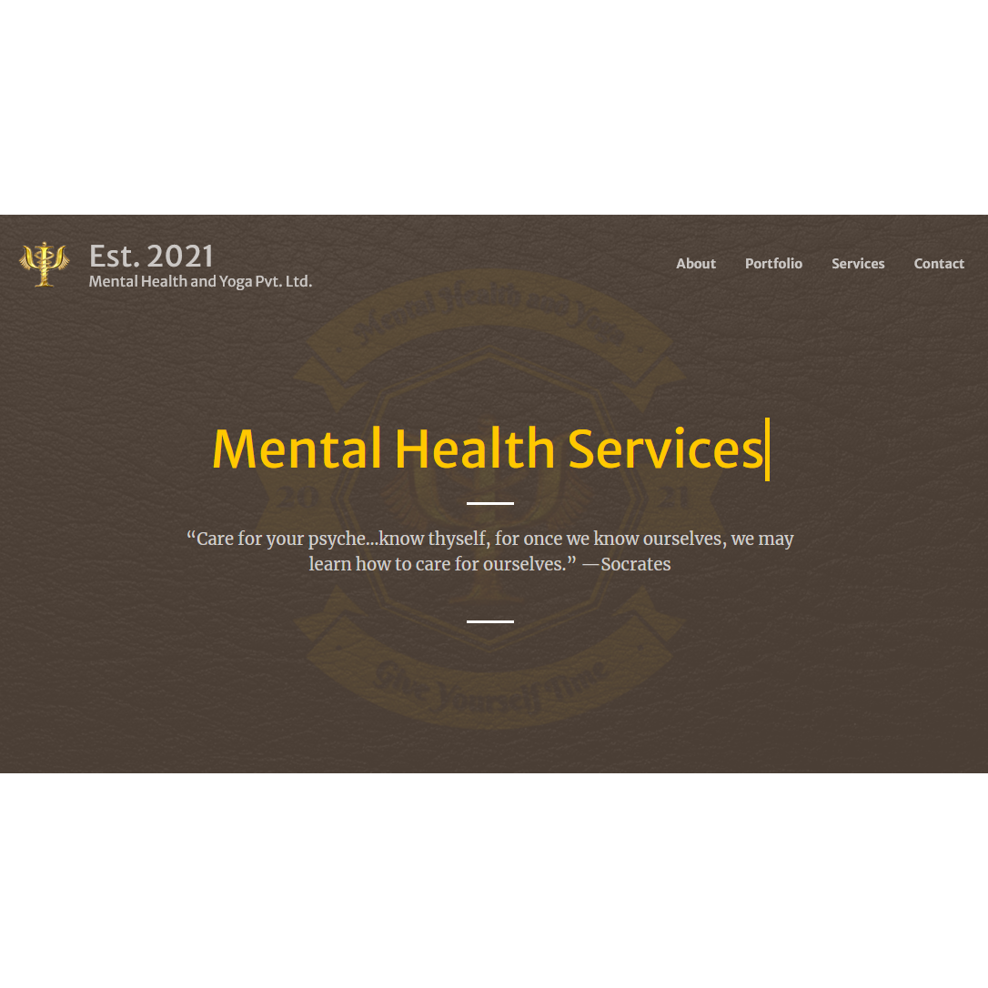
MHY Project is a responsive navigable website I Researched and Developed whilst at Mental Health and Yoga Pvt. Ltd. Inspired by a UX design and online presence I discovered that presence of a website is an asset to grow business and increase visibility. Loving a challenge, I set my self the task to Measure the Feasibility of responsive Website with simple to navigate. This case study tells the story on how I answered this using the button below, you can view the complete site.
The Research and Development vision was to ascertain whether there was any demand from the general public. To answer this a project plan was formed on in preparation to calculate a the Feasibility of online presence of Website with services listed :
It appeared that some aspects of their original plan were not feasible, in the sense that they did not include, or report, any user input throughout and so it was fair to infer that at this stage, was still in its infancy.
I highlighted my intentions to obtain some User input through listed services and requests of the services. This was to identify if there was any demand for the services from the general public, capture the user needs and emotions then design around the user and the business in a data driven method.
Tasked with designing the website to advertise the services depending on whether there was any demand for the services from the general public or more business orientated. This was answered using feedback from the users and in-kind service deliveries. Using the data, I was carried out the Ideation Prioritization on what was most important to show the Users that visited the website. Rapid Prototyping, Wireframes and Hi-Def designs were drafted and user tested for the website so that they were in the best possible position for the developers, the user and for the business.
Hands on UX Researcher of the company's prototype/existing similar products and Designer of the Website as part of their Marketing Campaign.
Hands on UX Researcher, Designer, UX Analyst and User Tester Facilitator for the Website Design.
Focus Groups, Design Thinking, Think Aloud Protocol, Data Driven Design and Future Improvement Development.
Two week's discovery and ideation, followed by one week of rapid prototyping, one week of User Testing and one week final product design.
I began by researching the existing market on mental health services for task scheduling. After multiple in-kind services and responding to various calls I collected data. The data allowed me to paint a clearer picture of what the User's wanted from the services, what they expected and more importantly an accurate representation on who wanted the services and what kind of services. This information provided me with enough information to further research.
What followed were efforts to map the existing user experiences to identify other opportunity developments:


Whilst interviewing the user's I ascertained that most of the services available on the market were too complicated for the everyday user. During the survey, I asked whether any of the participants had a similar services, which brand did they prefer and also which they did not like and why? Interviews were arranged through the survey, pain points were identified with our prototype and what the user would expect from the proposed website, this was so that I could paint a picture on a natural User flow for the site.
Based on discovery research findings I came up with three hypothesis to ensure successful
product
adoption. These covered:
The features were listed and mapped based in technical complexity, potential Business and User efficiency values. The highest impact features were expected to be included in the developed product.Data collected from the User Research and Discovery phase produced User expectations and Future Development Opportunities for further development of the application, which also gave more information on what to include for the website. This data along with expectations for the website design advanced Ideation into Hypothesis and Idea Prioritisation.
Concentrating on high impact feature sets allowed me to create a story that could be split into a few major user scenarios: Services Identity, simple human computer interaction and familiarity inspired by the product itself and intrigue from the competitive research. Focusing on the natural user flow, the usability and accessibility of the website, whilst keeping the focus on branding and the business advertisement requirements, the following steps in designing the website followed.
The prototype was developed using HTML5 for the structure, CSS3 to match the design specs, JQuery and Javascript to enhance the dynamic content. From the previously contacted users tested the prototype created for mobile and desktop experience. Queries from users made it possible to understand how the user's felt about the services whilst also testing the age ranges specified earlier to expand the customer base.
Based on the findings from both the UX research and the Design validation sessions I was able to produce a list of changes that were addressed and updated in the prototype along with any potential future alterations for the services passed onto the company. We did not want to confuse the users by advertising something that it wasn't going to be, so a decision was made to remove certain services and sections. Another thing was because of the potential improvements found was significantly different to the services we had, some of the details in the designs such as descriptive text will change once those improvements are developed. Below you will find links to the Design Specifications for the website. Please enjoy and thank you
Hopefully you liked what you seen, how the story unfolded and more importantly why the user experience was so important for potential development opportunities for the actual application and for the website design too.
You can click any of the links in the footer to contact myself through the social media platforms or by clicking clicking here and sending me a message. I usually call or message back as soon as possible.
Thank you for your time.